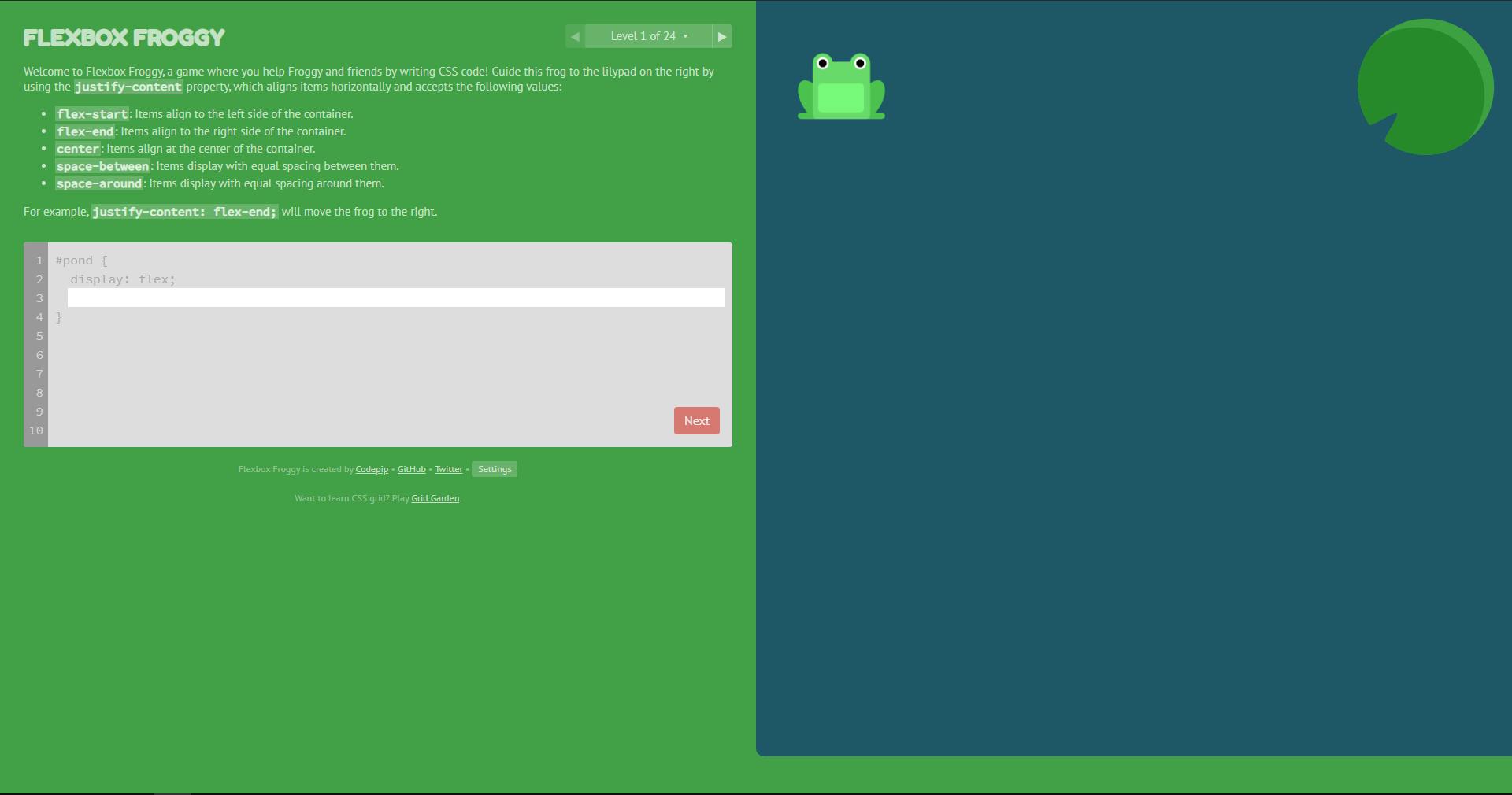
As a developer who works predominantly on the backend, I have always found myself taking more time trying to use the right CSS properties, to get the right kind of style for my website or my application.
Especially aligning elements correctly and spacing them. Oh boy, that was tough !! At least for me.
Enter Flexbox
So, I fired up Chrome and browsed through several articles which gave me an idea of how to use flexbox in my CSS. And I discovered this game where you are able to learn flexbox by practically trying it out right away.
FlexBox Froggy

So, this game, developed by CodePip, is free to play, and really helpful if you want to try out flexbox. You might need to have the knowledge of basic CSS, and need not even know or understand flexbox before. You don't even need to create an account to play it either.
 The game involves 24 levels, where you have to help Froggy, the frog, and his friends to reach the lilypads placed around them.
The difficulty increases as we progress through the levels.
There are three difficulty levels:-
- Beginner - Tips and directions are displayed
- Intermediate - Tips and directions are disabled, but the difficulty increases as you progress through consecutive levels.
- Expert - Random levels and no tips are displayed.
If you're a person who is already familiar with flexbox and just wants to try out the game, try the Intermediate or Advanced level.
It was really fun as I made progress through the levels.
Before I tell you about what all I was able to learn from the game, Here's an image from MDN docs to help give you an understanding of the flex container and the axes.
 Each of the properties mentioned below take values to position your elements according to your need.
justify-content: Aligns elements across themain axis, i.e horizontally.align-items: Aligns elements across thecross-axis, i.e vertically.flex-direction: Defines the direction of themain axis.
Quick Note: When the flex-direction property takes the value as column, justify-content and align-items change their axes with each other. If you play through the game, it occurs on Level 11.
flex-wrap: Takes the child elements to additional lines when they overflowflex-flow: A shorthand property for bothflex-directionandflex-wrapalign-content: Determines the spacing between the lines. It has no effect if there is only one line. Level 21 helps us understand this
As a beginner, I found it very useful to learn flexbox. Do try out the game and let me know in the comments how it turned out for you 💜
References : MDN Docs
